Case Study: Vis-À-Vis Health Website Development
Company Overview
Company: Vis-À-Vis Health
Project: Vis-À-Vis Health Website Development
Objective: Develop a comprehensive and visually appealing website for the launch of Vis-À-Vis Health's 2023 rebrand, which included a fully conceptualized new logo, marketing collateral templates, internal templates, business cards, a marketing deck, and a website built from scratch.
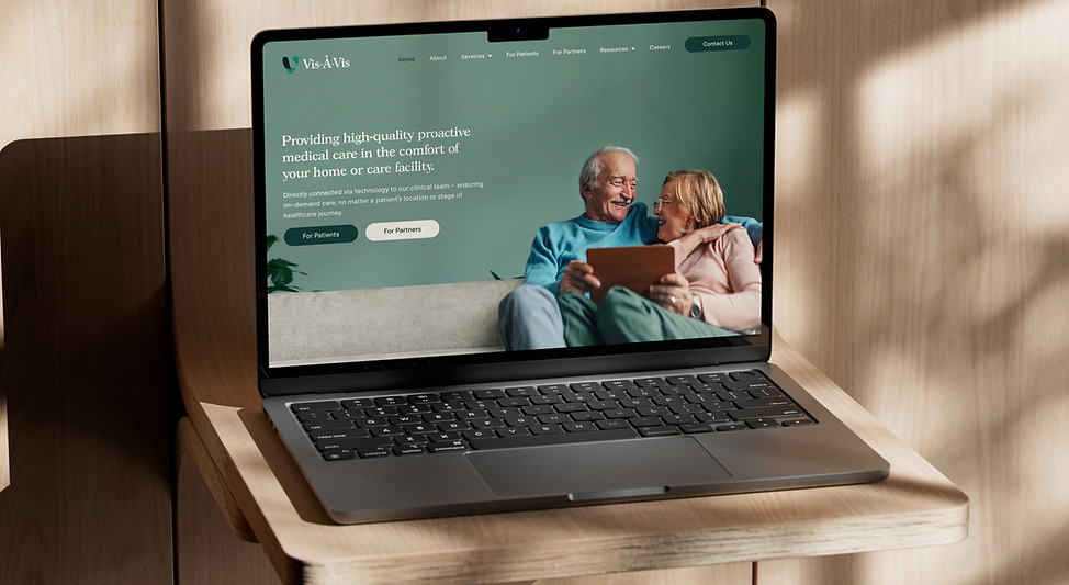
Website: Vis-À-Vis Health
💡
The Vis-À-Vis Health website development project demonstrated my ability to lead UX writing, content strategy, and design in a dynamic, cross-functional environment. By creating user-centric content and visually appealing designs, and working collaboratively with various teams, I contributed to a successful website launch that supported Vis-À-Vis Health’s goals and enhanced the overall user experience.
Background on Vis-À-Vis Health
Vis-À-Vis Health is a health-tech startup based in New York and is a healthcare service provider focused on delivering high-quality and personalized care. The company aims to revolutionize the healthcare experience by providing comprehensive health solutions, emphasizing patient-centered care, and leveraging innovative technologies.
Project Overview
Objective: Create a visually appealing and user-friendly website that effectively communicates the mission, services, and benefits of Vis-À-Vis Health, while establishing a strong brand identity.
My Role: VP, Marketing and Branding
Responsibilities:
-
Leading the UX writing and content strategy
-
Designing the website using Adobe XD and Figma
-
Creating a cohesive brand identity incorporating new logo and marketing materials
-
Collaborating with cross-functional teams including sales team members, executive leadership, and developers to ensure a seamless user experience
Process Execution
1. Research and Planning:
-
Stakeholder Interviews: Conducted interviews with key stakeholders to understand business objectives and desired user experience.
-
User Research: Conducted surveys and created user personas to identify target users' needs and pain points.
💡 Thought process: For user research, I focused on understanding the needs and pain points of elders on Medicare. I discovered that they require clear, accessible information about Medicare benefits, user-friendly navigation, and trustworthy support. Their challenges include navigating complex information, dealing with inaccessible website design, and finding reliable assistance. This research guided the development of a compassionate and straightforward content strategy, ensuring the Vis-À-Vis Health website addresses these needs effectively and alleviates common frustrations.
-
Competitive Analysis: Reviewed competitor websites and similar services to identify best practices and opportunities for differentiation.
💡 Thought process: In conducting competitor analysis for Vis-À-Vis Health, my goal was to understand how similar healthcare websites address the needs of elders on Medicare. I reviewed competitors’ content strategies, user interfaces, and overall messaging to identify strengths and gaps. This analysis helped me pinpoint best practices and opportunities for differentiation, ensuring that Vis-À-Vis Health stands out with a unique, compassionate, and user-friendly approach tailored to our target audience.
2. Content Strategy Development:
-
Brand Voice and Tone: Established a compassionate and professional brand voice to reflect the patient-centered approach of Vis-À-Vis Health and resonate with target users.
💡 Thought process: For the Vis-À-Vis Health website, I established a compassionate and professional brand voice to reflect its patient-centered approach. Given that the site serves elders on Medicare, it was crucial to convey empathy and trust. This ensures that the content resonates with the target audience and supports their emotional and informational needs effectively.
-
UX Writing: Wrote engaging and informative copy for the homepage, service descriptions, and call-to-actions, ensuring users quickly understood the benefits of Vis-À-Vis Health.
-
Content Hierarchy: Developed a content hierarchy that clearly communicated the services, benefits, and mission of Vis-À-Vis Health, guiding users through an intuitive journey.
💡 Thought process: We needed to ensure users were directed to the most relevant content immediately upon entering our site. To do this, I implemented distinct "Patients" and "Providers" buttons prominently in the hero section at the top of the homepage. These buttons serve as a clear and immediate gateway, guiding users to the appropriate sections designed specifically for their needs. For patients, the content emphasizes empathy, personalized care, and easy access to healthcare services. For providers, the information focuses on professional collaboration, technical accuracy, and detailed service descriptions. This strategic navigation not only enhances user flow but also ensures that our messaging and information are accurately targeted, providing a more efficient and satisfying experience for all users.
Design Implementation
1. Website Design and Branding: Designed the entire website layout using Adobe XD and Figma, ensuring a cohesive and visually appealing design that enhances the user experience. The website's design aligns with the new rebrand's assets, including the logo, colors, and fonts, to maintain consistency and reinforce the brand identity.

💡 Thought process: I wrote and designed a pop-up to greet users upon arrival, explaining the new site look and key features to help ensure a smooth transition and reduce confusion by quickly informing users about the new look.
2. Collaboration and Implementation:
-
Design and Content Integration: As the sole designer, I ensured that the new microcopy and visual elements were seamlessly integrated into the website’s interface. This ensured that the visual design and written content complemented each other, creating a unified and engaging user experience.
-
Development Coordination: Collaborated with developers to implement the new UX writing and design elements, ensuring that the technical execution was aligned with the intended user experience.
-
Testing and Iteration: Conducted usability tests to gather feedback on the design and content, making further refinements based on user feedback and data.
Challenges
Consistency Across Teams: Ensuring consistent messaging and branding across all touchpoints required continuous communication and collaboration with various teams.
Balancing Detail and Simplicity: Striking a balance between providing detailed information and maintaining a simple, user-friendly experience was crucial to keep users engaged without overwhelming them, especially understanding we're serving a predominantly elderly audience.
Differentiated Tone and Messaging: Creating distinct yet cohesive messaging for both patients and providers to address their unique needs and expectations was a key consideration throughout the project.
Results and Impact
Improved User Experience: The new website offered a clear and engaging presentation of Vis-À-Vis Health’s services, leading to a more intuitive user experience and higher user satisfaction.
Increased Engagement: The effective content and design strategy led to higher engagement rates, with users more readily understanding the value of Vis-À-Vis Health and navigating the site with ease.
Strong Brand Alignment: The content and design reinforced Vis-À-Vis Health’s brand identity, positioning it as a leading provider of personalized healthcare solutions.